My new music project for 2018 is an album entitled Crossover.
Having returned to the world of my first album last year, with Back Into the Light, I also found myself thinking back to my roots and looking at the original influences which made me want to create instrumental music in the first place.
The albums in question are Mike Oldfield's Tubular Bells and Jean-Michel Jarre's Oxygène – two hugely influential and staggeringly unique albums that emerged in the 1970s and changed the face of both rock and electronic music. While very different in style and production, both albums took you to another place; like a vast musical world to explore. The tracks flowed seamlessly into one another, creating a continually evolving soundscape.
As a self-taught musician, every project is a learning curve and a progression. And from each, there is something that has taken me into the next. But looking back at how those albums influenced my work, I realised that I hadn't actually tried my hand at creating that kind of continuous, flowing album, so it was time to put this right!
Crossover contains just 3 tracks, but with each one lasting between 12-15 minutes and moving through a variety of styles and atmospheres. It is an album where dark and light battle it out, but also a journey and a dream-like adventure – and my most ambitious album to date.
Here is the cover art:
I am constantly fascinated with that shift between worlds, whether it is in our own dreams, films or books – particularly books. I love the often sinister blurring of alternative existences in Christopher Priest's work, in books such as The Glamour, The Affirmation or A Dream of Wessex. Then there's the wonderful writing of Haruki Murakami; his books brimming with poetic metaphors, but also characters who cross between planes or realities. I love how one moment you're in a bustling urban environment, but Murakami can take you into a building such as a hotel or office block and through there, you enter someplace else. However one of the origins of Crossover was Blake Crouch's recent book, Dark Matter. An incredible, if mind-bending read, but the travel between alternative realities and the journey of the characters really got me thinking how I might score a "soundtrack" for such a thing.
While that kind of journey is at the core of Crossover, it also remains open to interpretation – after all, there are many points in our lives in which we find ourselves transcending from one point to another, physically, emotionally or psychologically.
Creating a cohesive musical interpretation of all of the above (and more) has been a real challenge, but also a creative, fun and rewarding one, and I look forward to sharing some clips from the album soon.
Crossover will be released at the end of March, to coincide with my attendance of "Follycon", this year's Eastercon event, taking place in Harrogate. My plan is to launch the album there, where I'll have a limited physical release on CD.
Watch this space...
Showing posts with label album cover. Show all posts
Wednesday, 14 February 2018
Thursday, 7 September 2017
Back Into the Light - cover art reveal!
I'm thrilled to announce that the cover art for Back Into the Light will again feature astounding artwork from renowned space and science fiction artist, David A. Hardy.
In my home office/studio, a framed canvas print of Hardy's painting, Ocean of Space hangs above my Mac, and acts as a constant source of inspiration as well as being a portal to another dimension. As I was working on Back Into the Light, I found myself staring at the piece more and more – and I released that it simply had to be the album cover.
Although Back Into the Light is not a space-themed album, what I loved was the central glow in the almost animated looking galaxy, and how it reflects through the crashing waves in the foreground. The sea has often be a recurring theme in my music (see: Traces), and I think that's what drew me to this particular piece more than anything.
David A. Hardy of course provided the cover art to my original Into the Light album back in 2007, so this really makes a perfect follow-up, especially being of a similar palette. Although with that in mind, the music of the new album obviously has to live up to the expectations delivered by the cover!
In my home office/studio, a framed canvas print of Hardy's painting, Ocean of Space hangs above my Mac, and acts as a constant source of inspiration as well as being a portal to another dimension. As I was working on Back Into the Light, I found myself staring at the piece more and more – and I released that it simply had to be the album cover.
Although Back Into the Light is not a space-themed album, what I loved was the central glow in the almost animated looking galaxy, and how it reflects through the crashing waves in the foreground. The sea has often be a recurring theme in my music (see: Traces), and I think that's what drew me to this particular piece more than anything.
David A. Hardy of course provided the cover art to my original Into the Light album back in 2007, so this really makes a perfect follow-up, especially being of a similar palette. Although with that in mind, the music of the new album obviously has to live up to the expectations delivered by the cover!
For a limited time, Into the Light is available on Bandcamp as a 'name your price' release - which of course means you can grab it for free!
Stay tuned for further updates and music samples from Back Into the Light...
Back Into the Light will be released via Bandcamp in late September/early October.
Tuesday, 8 July 2014
Back Into the Light
This was my view. Well, one of many breathtaking views. Out
of shot to the right, you’d eventually see the sea. Nobody else for miles
around, epic views and that kind of special-smelling warm air and sea breezes that
you get from being high up. The atmosphere up there in the Andalusian mountains
was tranquil to say the least.
This was 7 years ago now, and round about this time of year.
I’m always frustrated by the seemingly fast passing of time in such
circumstances. You want to hold on to and preserve certain memories as much as
possible and keep them close, as if they were yesterday.
I fondly recall reading Mike Oldfield’s autobiography Changeling – a revealing and inspiring book, well recommended. Reading the stories behind the making of his albums whilst looking at those mountains, with music
drifting out from the villa was a great source of inspiration. It was here that I always claim my album Into the Light was born.
While I didn’t actually compose the music there, that place
was where many of the ideas came and gradually filled up my head. I’d make
mental notes of ideas for riffs or arrangements. The real challenge was to
remember everything and try and capture it all once I returned home! It's rare to be able to describe
something as perfect, but that really was, and I wanted to somehow bring that
essence and optimism into the music.
Into the Light remains
a very personal album for this very reason, as I feel I did capture what I
wanted in the music. Every time I hear it, I’m transported back there.
Of course,
this was just one small element of that stay in Spain, but the one connected to
my music. A few of the album's tracks were made before this however, and had
very different backgrounds! Two examples being "Beyond the Clouds",
which was composed the day after a rather unpleasant stomach upset(!), and the
title track came about after having a rather harrowing dream where I'd been
shot, and was suddenly traveling towards, and into a blinding light.
And that's
how the title came about.
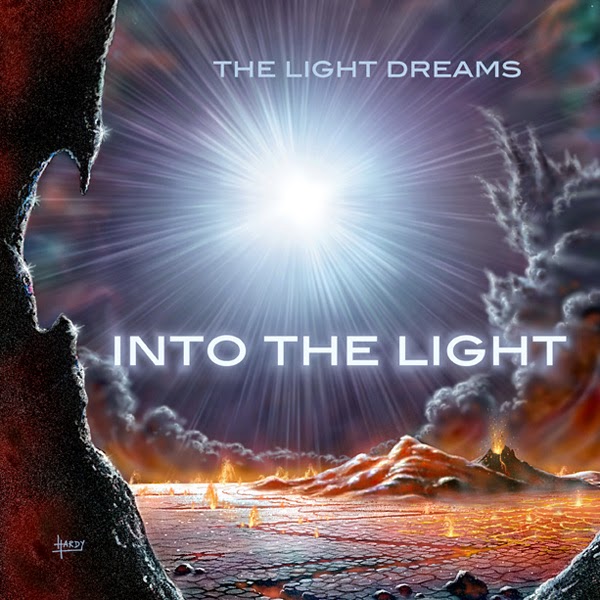
So Into the Light really is an album
inspired by travel and dreams. Yet it also has an other-worldliness to it,
which is perfectly reflected in David A. Hardy's beautiful cover artwork.
This particular
painting caught my eye in 50 Years in
Space: What We Thought then… What WeKnow Now, the wonderfully illustrated book Hardy co-produced with the late,
great Sir Patrick Moore.
As an
artist, I usually have quite a clear idea about how my album cover should look,
and that it should also be my own work, as an extension of the music. But in
this case, Hardy's painting leapt out of the page at me, and was just perfect.
A few emails later and the album cover was there!
I regard Into the Light as my first proper album.
My real début. I'd made several demo albums prior to this that were basically
my exploration of sound and what I could do. But with this album, everything
came together and fell into place, as a culmination of all those ideas that I’d
experimented with over the previous year. As an early work, I guess it has its
shortcomings and imperfections, but it wouldn't be the same without them.
In the
autumn of 2007, the initial version of the album was up on MySpace for
streaming and briefly on one or two other sites for download.
I didn't
make another album I was happy with until 2009 with Mechanical Drive, but shortly after completing that project, I took
my music offline and didn't make any for almost three years.
When I
returned to making music in 2012 with Inferno,
knowing I was going to have a go at actually selling my work online, one of my
priorities was to return to Into the
Light and give it a bit of a remix before putting it online, especially
since several software upgrades had rendered some of the original sounds useless,
so substitutes had to be found. As I was firmly back in the mindset of the
album, I wrote a brand new piece of a similar style entitled “Cyclic”, which
comes as a bonus track with the full album download.
Initially
it felt too soon to be revisiting the album - but then it occurred to me, that
I was in fact, finishing it off!
I'm still
incredibly proud of Into the Light
and it remains very special to me, almost like a bookmark of a certain point in
life. It's also where the music of The Light Dreams really begins...
Cover art:
David A. Hardy/Astroart.org
Sunday, 2 March 2014
Traces: the cover design
With just a day to go before I unleash my new album, Traces - almost a year in the making - I thought I'd explain my thinking behind the cover design.
The basic concept of Traces is that of dreams and memories – and their convergence in our subconscious. A common dream theme is the sea, which has often been described by dream analysts as the transition between the conscious and subconscious. It has also been suggested that a dream of the sea, water, waves, etc is representative of our emotions.
I’ve certainly had dreams in such an environment, and it was also a recurring setting in some of the books I was reading whilst making the album. And who hasn't felt totally at ease and relaxed when staring out into the sea? All of this made me think more and more that the album artwork needed to be a sea view.
It’s the first photographic album cover I’ve done in a while – and long overdue. Initially I had planned an entirely black cover with just the ‘TRACES’ lettering, and similarly typographic artwork for the booklet, leaving it completely open to interpretation. But the more the music evolved, the less I felt a black cover would represent it. I wanted muted colours and something dreamy. Plus, as a synaesthete, it was important at least to me, to get the 'colours' right across both the cover and the music!
The basic concept of Traces is that of dreams and memories – and their convergence in our subconscious. A common dream theme is the sea, which has often been described by dream analysts as the transition between the conscious and subconscious. It has also been suggested that a dream of the sea, water, waves, etc is representative of our emotions.
I’ve certainly had dreams in such an environment, and it was also a recurring setting in some of the books I was reading whilst making the album. And who hasn't felt totally at ease and relaxed when staring out into the sea? All of this made me think more and more that the album artwork needed to be a sea view.
It’s the first photographic album cover I’ve done in a while – and long overdue. Initially I had planned an entirely black cover with just the ‘TRACES’ lettering, and similarly typographic artwork for the booklet, leaving it completely open to interpretation. But the more the music evolved, the less I felt a black cover would represent it. I wanted muted colours and something dreamy. Plus, as a synaesthete, it was important at least to me, to get the 'colours' right across both the cover and the music!
After looking through my own photographs, I settled on one particular shot, which had just the right
composition. I worked on the colouring for a subtle effect, with hues
that in my mind matched the music. Through the colouring, I wanted to give an ordinary scene, just that gentle hint of something extraordinary.
Many of the images I used in the rest of the artwork convey the reflective and nostalgic mood of the album, but in a slightly more detached way. I had been experimenting with a
video for the title track using some old archive film footage that made a nice juxtaposition with the music. So I took stills of these as complimentary images.
Traces will be available from Bandcamp on CD and MP3 from 3rd March 2014.
Labels:
album,
album cover,
artwork,
colours,
design,
dreams,
music,
synesthesia,
traces
Subscribe to:
Posts (Atom)